5 Things I Learned From This Project
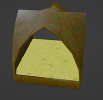
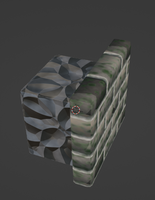
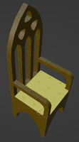
I've been working on these assets on and off for the past few months. It was a highly educational experience, and beyond just learning more about modelling and texturing in blender, I learned many specific lessons as well.
1. Keep A Clear And Narrow Scope!
I dived into this project without a clear idea of the work or timeframe. It got to the point where I was just sick of working on it. Originally I wanted to make a level from the assets, but I've decided it would be better to make a level from simple geometry, in order to learn Godot.
2. Don't Attempt Precise Damaged Objects
I wanted to have a castle wall that was damaged with missing parts that the player could traverse. However, this proved far more difficult to model and texture than expected. It required many different variations of the same building block with slightly different geometry. This exacerbated the issue of scope creep, since this feature alone could have been a whole project. I learned that it is better to make things in a way where assets can be arranged without needing many variations of a single object. Dishonored, for example, mainly utilizes pipes, air conditioners, beams, and catwalks for its platforming geometry. Damaged objects are best kept to a single variation and used for decoration.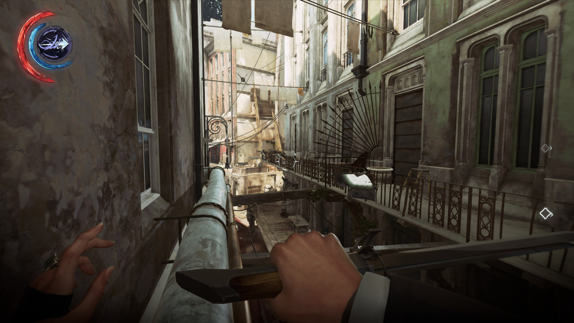
3. Concave Corners Are Convenient
In the course of modelling the castle wall blocks, I realized the importance and utility of concave corners. Firstly, they require less geometry, as because there is no protruding material to wear away, they need not be beveled. Secondly, they are a good place for UV seams, particularly those that divide different materials, as we expect convex corners to appear this way. Seams between coplanar polygons will be highly obvious. 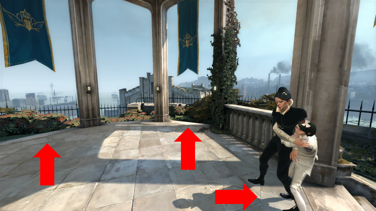
4. Seamless Textures - Not As Good As They Seam
In my studies at wake tech, I learned about seamless textures and how to create them. In this project, I learned how to create seamless noise and voronoi. However, I also learned the hard way that seamless images alone are an inefficient way to texture objects. On large objects, the UVs must be scaled to an inconveniently large size. It also forces you to adapt your UVs to your textures, rather than the other way around, and creates obvious seams with no option to add edge wear. Overall, my programmer's instinct for efficiency hurt me in this case.
5. Square Grids Really Are Optimal
I have a minor passion for geometry, and my original plan was to attempt to create a modular pack that allowed for 60, 90, and 120 degree angles. However, I quickly realized just how complicated this makes things and scrapped this early in the project, after being forced to confront that fact that square grids are simply the best for modular art. Besides the obvious fact that squares can be laid out nicely in 2D space with rational and/or integer coordinates, they can also more easily approximate triangles and hexagons (within a few degrees) than either of those shapes can approximate them. Hexagons and triangles really only make sense in a context where neighboring cells are relevant to gameplay.
Files
Get Modular Gothic Town (Unfinished)
Modular Gothic Town (Unfinished)
| Status | Released |
| Category | Assets |
| Author | lucasjonesgamedev |
Leave a comment
Log in with itch.io to leave a comment.