Environments in Iconoclast
Hey everyone! It's Ian again. If you don't remember me from the last devlog about VFX, I am one of the environment artists. As we approach gold, our environments are also being finalized. Today I am going to show you the extensive progress we've had with environments, and all the small details we've been adding! Note this post is very image heavy.
First, let's take a look at the level one level design sketch.
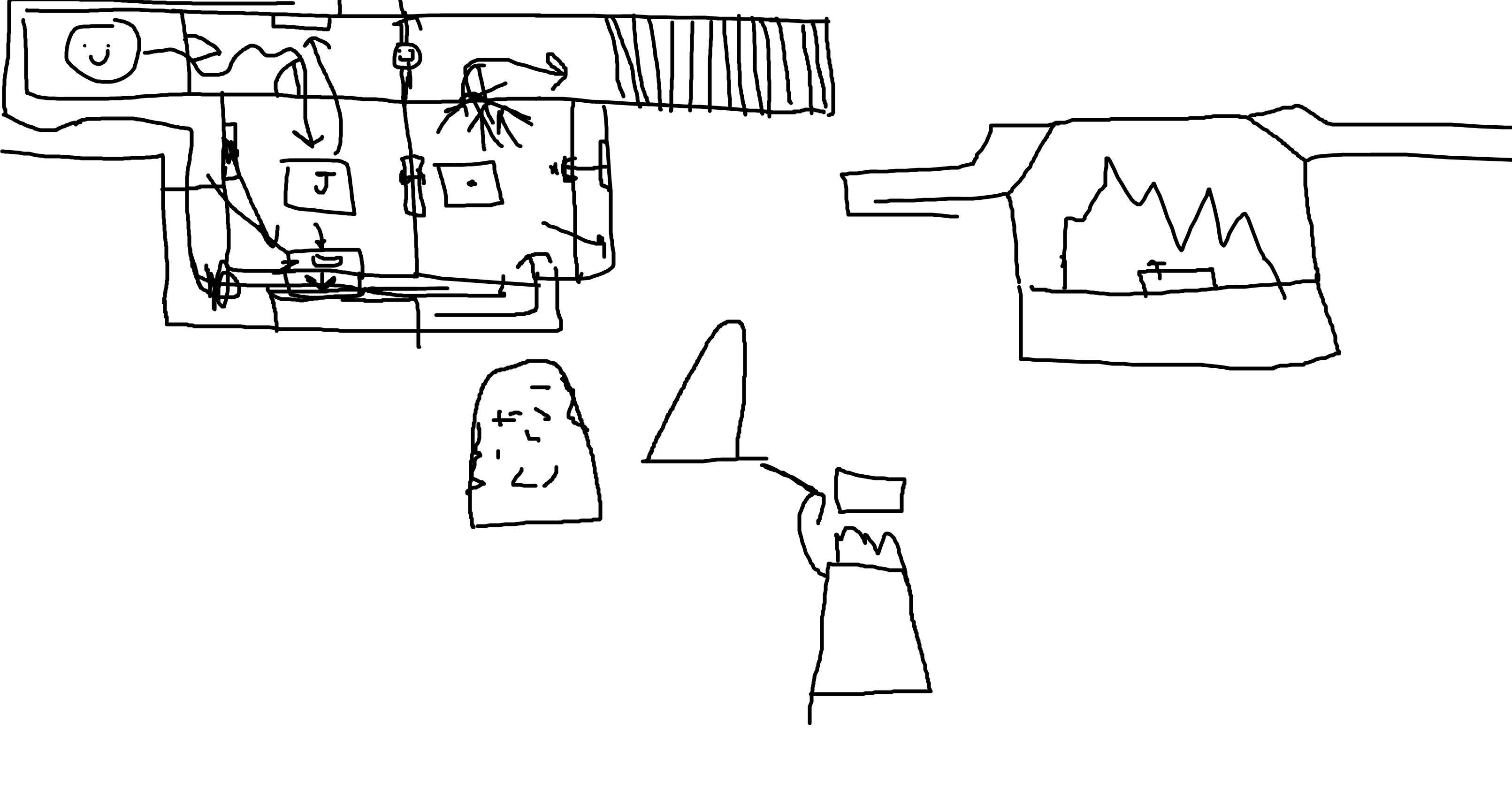
Yeah, yeah I know. My artistic skills are amazing. This took a few minutes but it was enough to give us an idea of how we wanted to route level one, and how to white box it. Take a look!
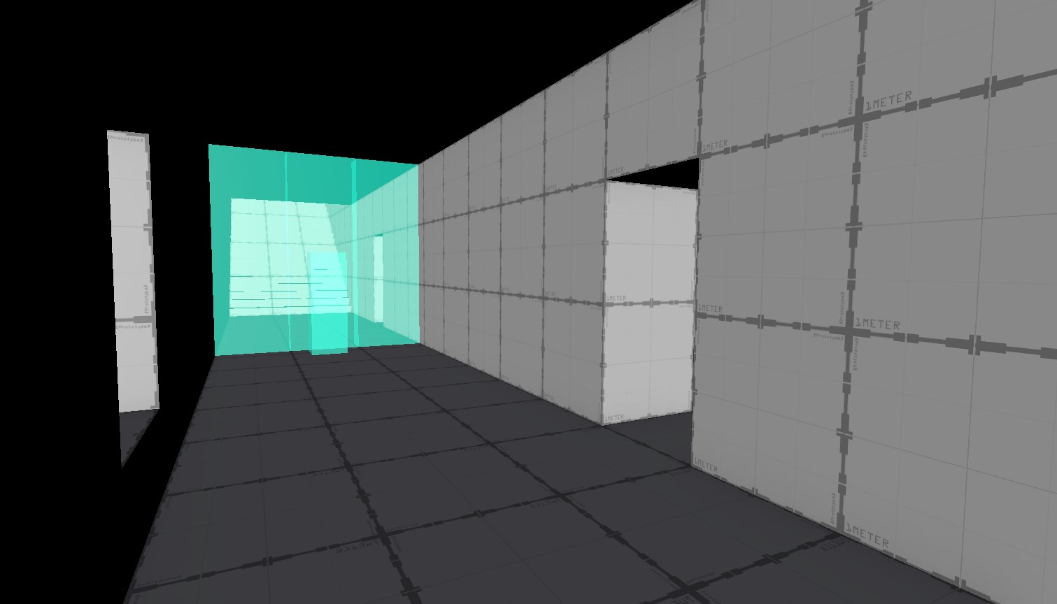
We first designed level one as a hallway, with a kitchen, back passageway, and storage room. After whiteboxing, we begin putting in placeholder props and assets! Here's the kitchen:
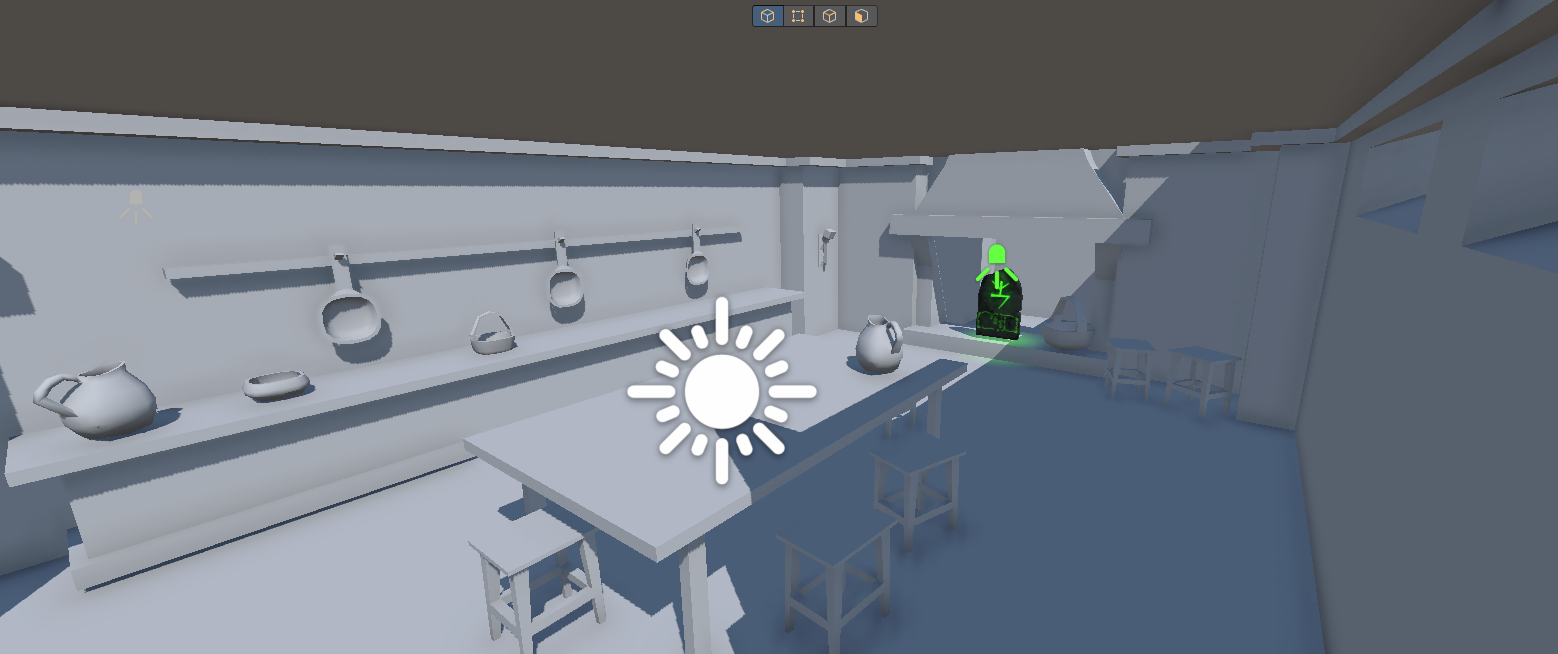
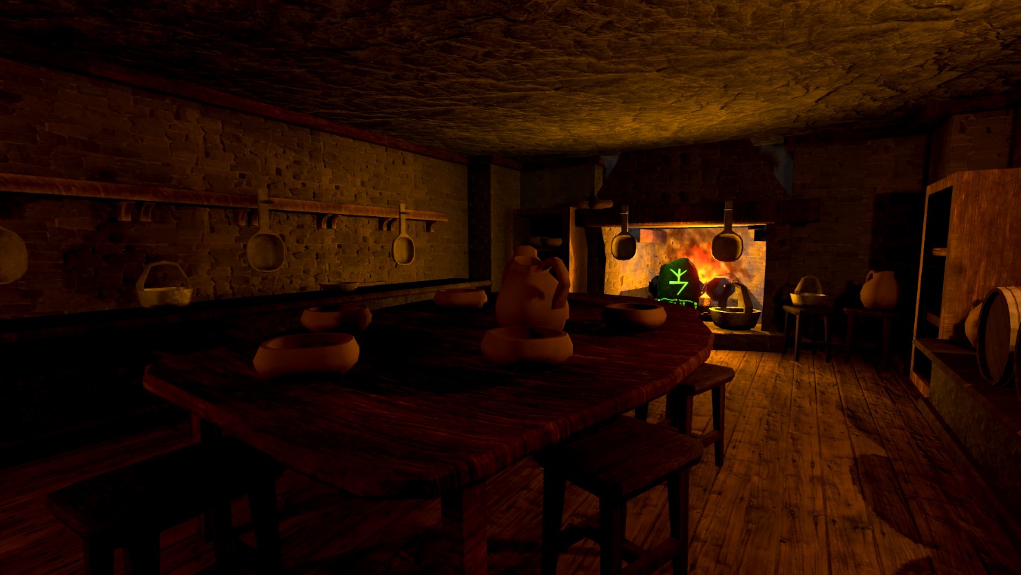
Here is a before and after of basic, untextured and placeholder models with the final! Note, lighting is NOT final and being changed/revised often.
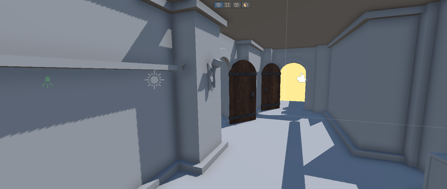
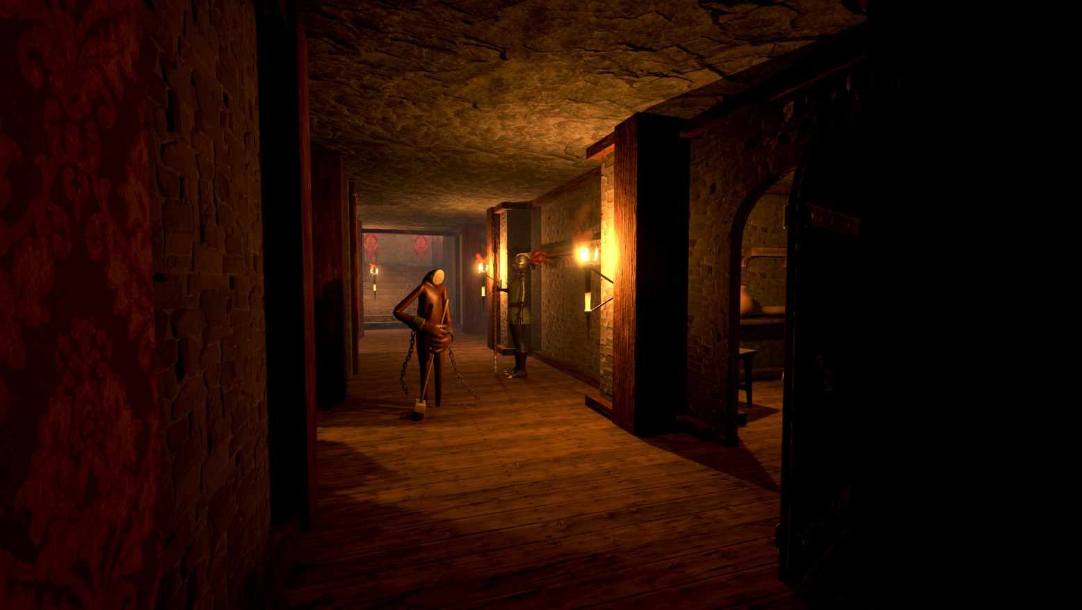
Here is the before and after of the hallway. Lighting, textures, and assets definitely spruce it up by quite a bit. This image is the same angle as the whitebox from earlier. Take a look and see how far we came! Note the lighting still isn't final. We noticed that level one was quite short, so we added another wing to the environment, here's a small look at it:
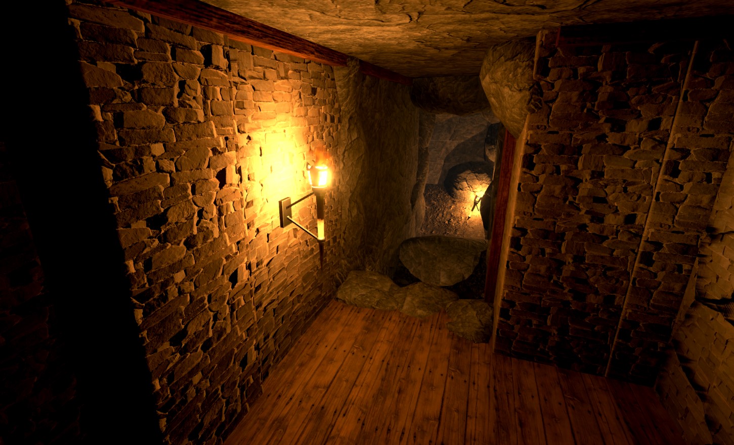
Level Two due to a bunch of variables took a much more drastic change. First, we started off with another bad level design drawing.
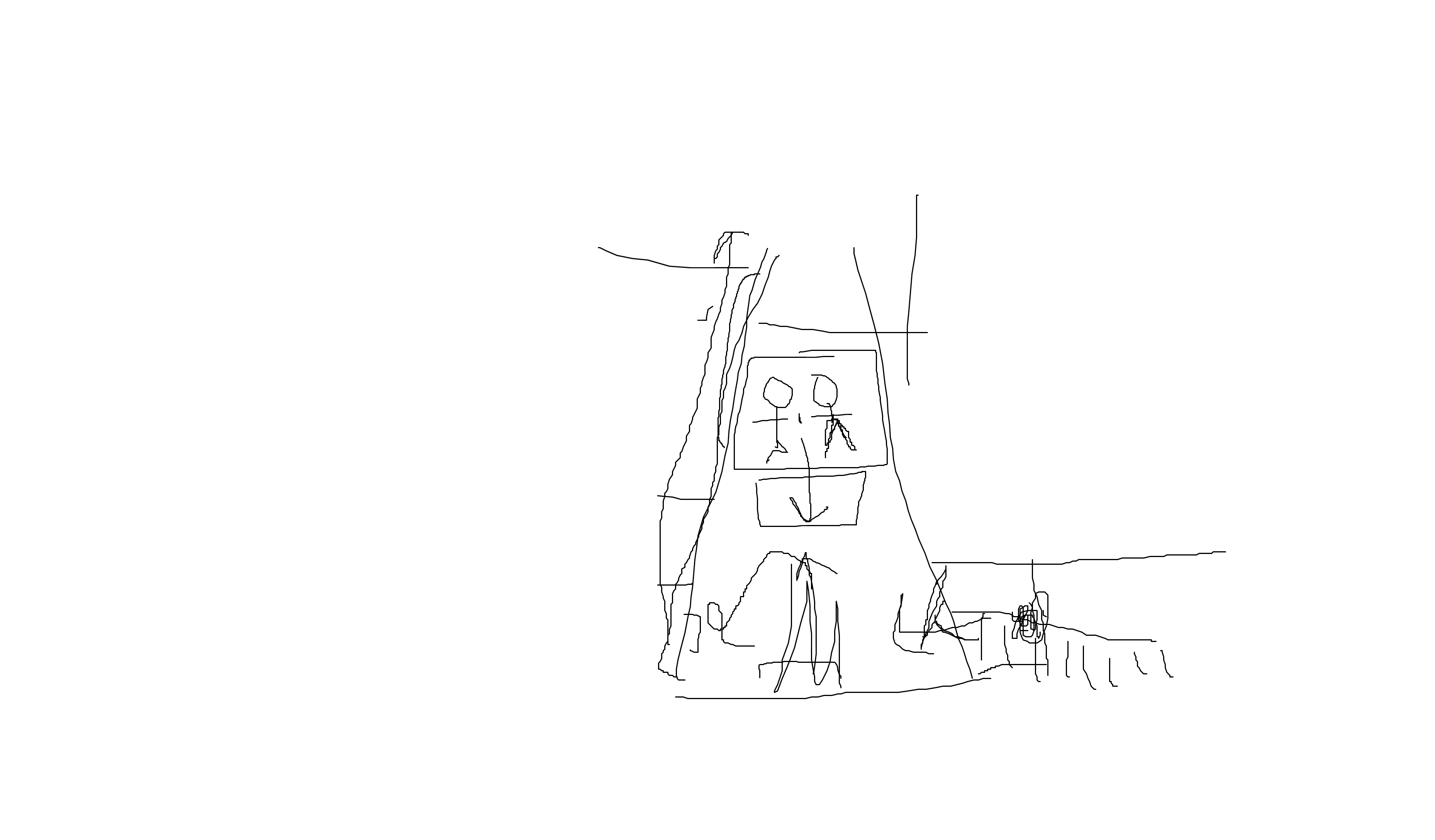
I know, I know. It's even BETTER than the draft of level one. This was a draft made with Jacob to figure out how we want the vibe of level 2 to be. We knew we wanted for level one to be linear, but for level two to free up player choice and give them more freedom. We ended up developing this into this first whitebox here:
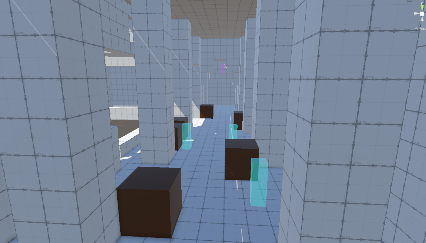
Very cool whitebox, but honestly it doesn't even look similar to how it does now. After losing some level files due to weird version control issues, it was redeveloped to be more of a palace. Here's the next version with replaced assets.
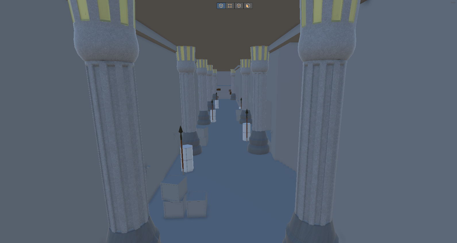
We then ended up overhauling level 2 and taking multiple art passes, leading us to what we have now:
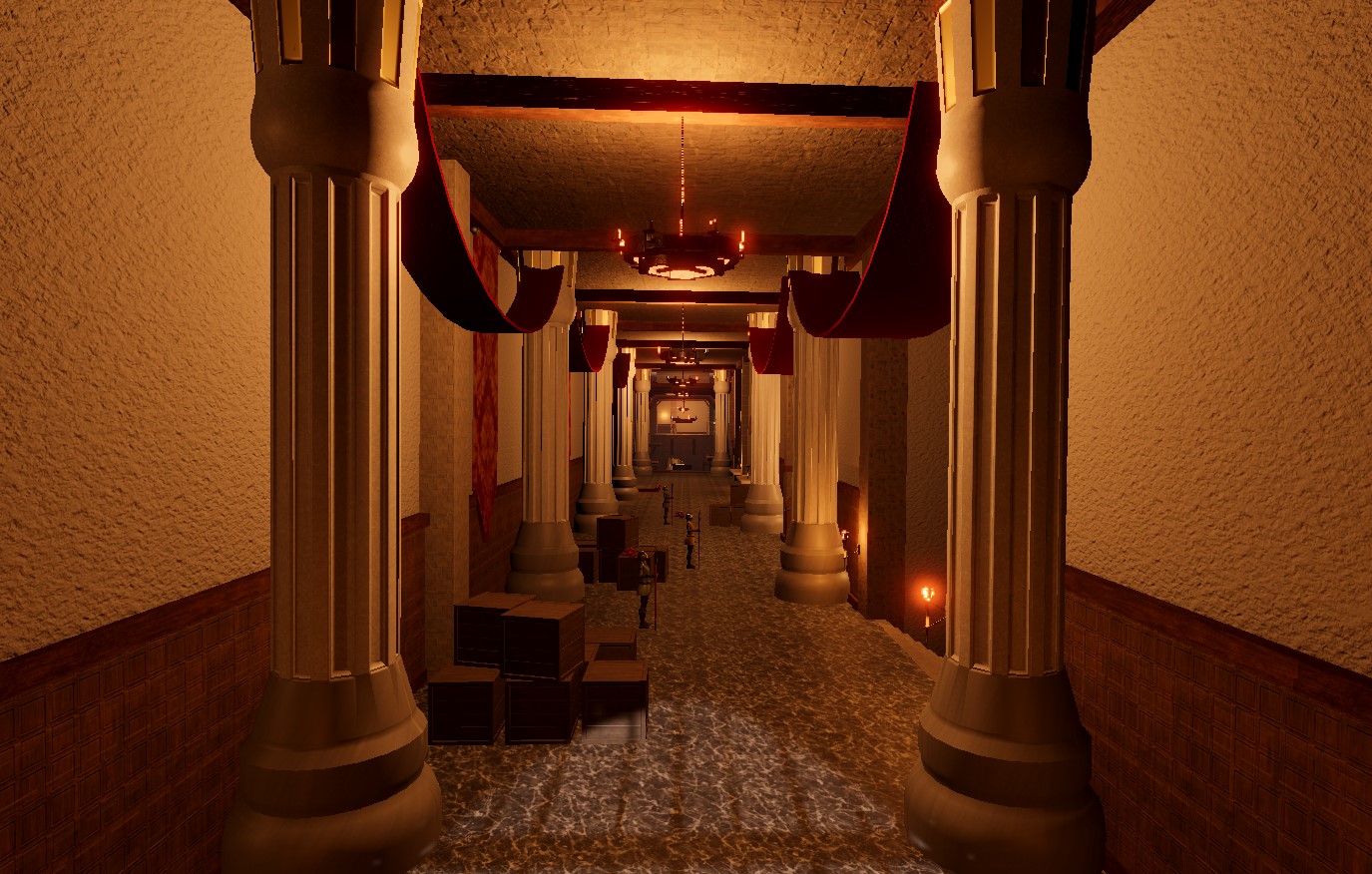
The walls were widened, and rooms were added to free player movement and choice. It was also made slightly longer and contains much more interesting puzzles and routes in comparison to level one, really testing player ability and allowing the player to explore more. Here is a before and after of a jumping puzzle you can see further down this hallway:
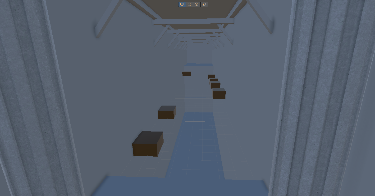
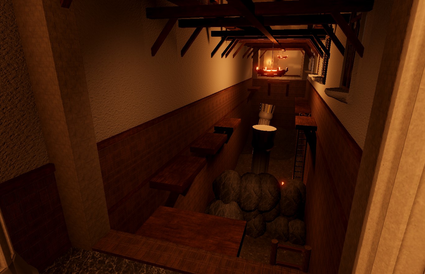
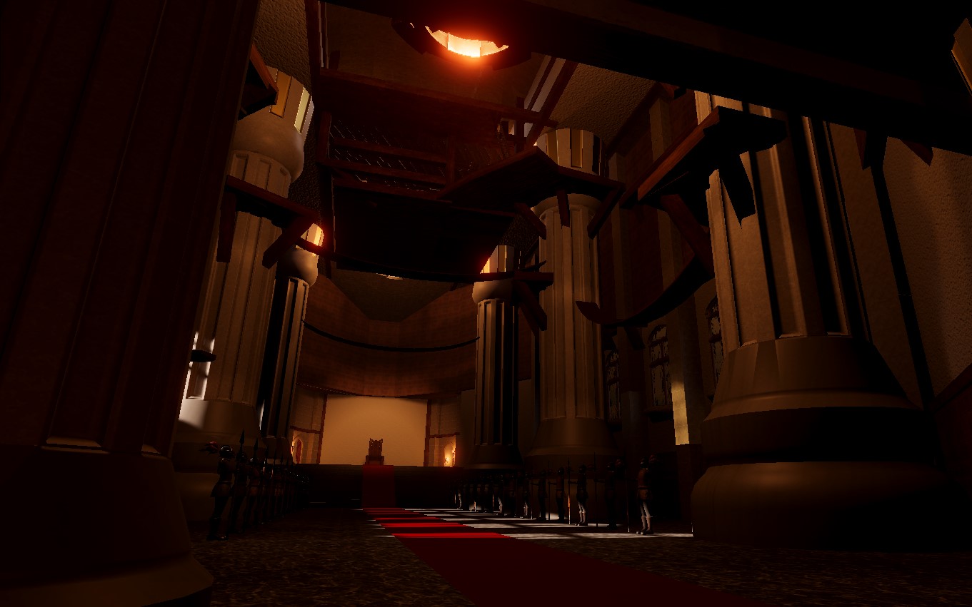
Note, the lighting isn't final and fully baked. It is darker than it should be. But here is one of the final rooms in level two, for the player to navigate towards. Note the guards, stay clear of them!
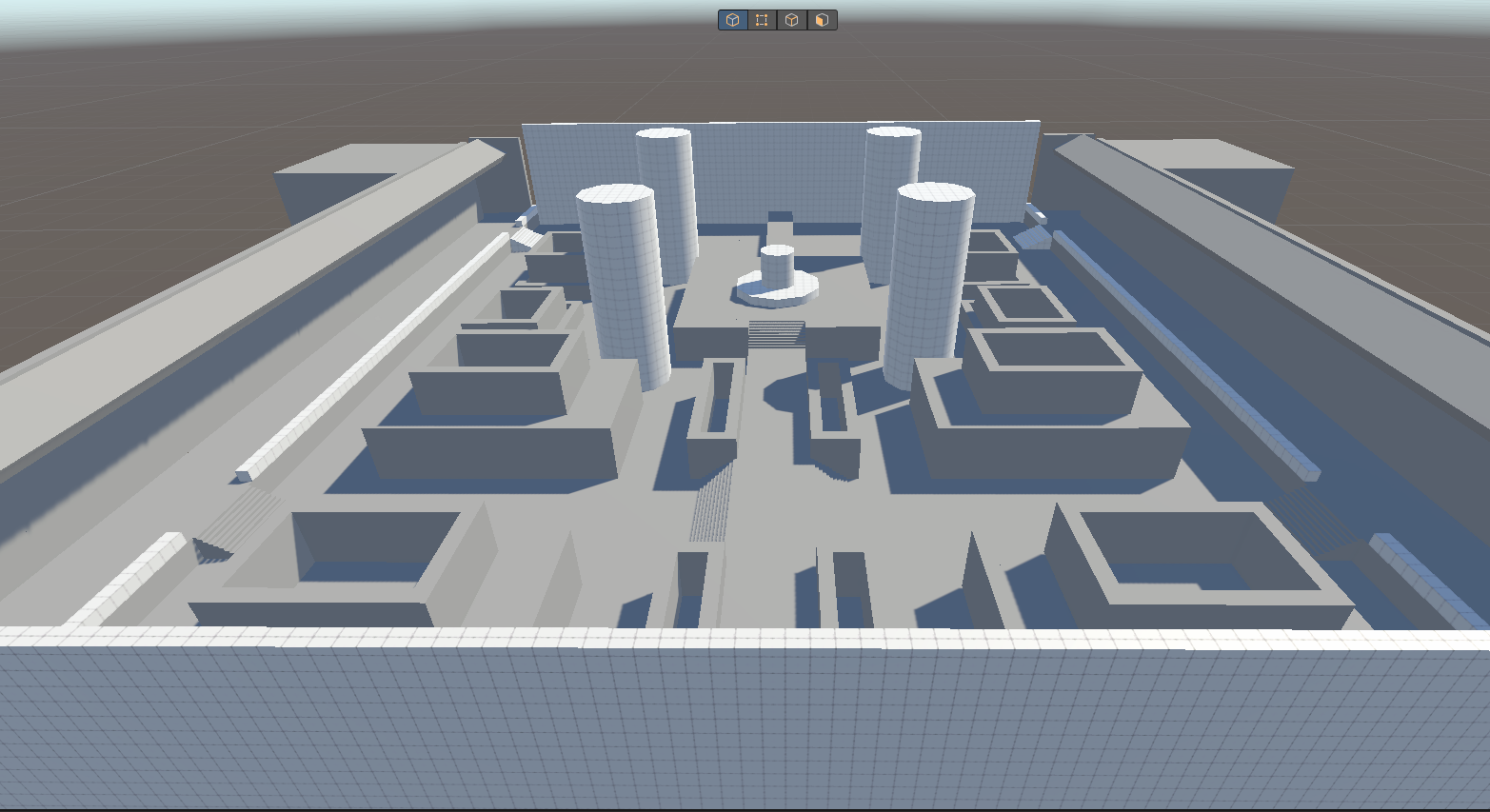
Level three was mostly handled by Jacob. Here is a before and after of the whitebox/assets to the current version we have now. Note the lighting is NOT final!
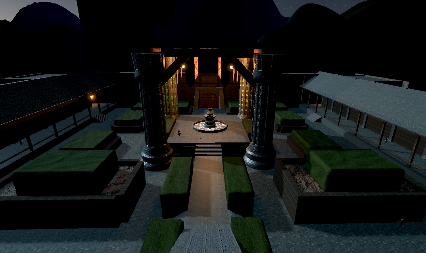
Thanks for reading! We have put a lot of work into the environments and hope you enjoy them when we ship the game.
Get Iconoclast
Iconoclast
Break the rules - literally.
| Status | Released |
| Author | lucasjonesgamedev |
| Genre | Platformer, Puzzle |
| Tags | 3D, Fantasy, First-Person, Puzzle-Platformer |
More posts
- One of the problems with Unity's CharacterController, and how we solved itJul 24, 2023
- Worldbuilding - How To Develop Your Game's SettingJul 19, 2023
- The Art of IconoclastJul 19, 2023
- Adding detail and depth with just texturesJul 07, 2023
- Player Movement RefinementsJul 04, 2023
- Enhancing player experience with VFXJun 27, 2023
- Creating a character from concept art to fully animated!Jun 12, 2023
- Alpha UpdateJun 05, 2023
Leave a comment
Log in with itch.io to leave a comment.